

Go back to Blog


8 min read
Share to
How Friction in UX Design Aids Fraud Prevention
A couple of weeks ago, I packed up my life and moved to the UK. While getting used to a new place, finding my way around, and buying things for my new home, I faced a money problem. As an immigrant, I had only brought a few pounds with me. All my other money was still in my home country's currency. Obviously, I needed to find a way to change that so I could spend it here.
While visiting a friend, I mentioned my problem. My friend suggested a fintech platform that allows me to transfer my Naira funds to Pounds easily. I thought, "Why not?" and started setting up an account on my phone. Then, I hit a bump in the road — I had to prove who I was by taking a picture of my ID. The app wouldn't let me upload a saved file.
Usually, I keep photos of my IDs on my phone so I can pull them up whenever I need them. But this was different, and I didn't have my ID on me. Trying to be clever, I sent my friend the saved photo of my ID and tried to take a picture of that picture from his phone and use it. But the app was too smart for my workaround. It knew what I was trying to do, and it didn't work. I had to wait until I got home to finish signing up.
At first, I was annoyed because it felt like a hassle. But later, I realized that this extra step was there for a good reason — to keep my identity safe. It's there to stop someone else from pretending to be me if they have a photo of my ID on their phone or if they steal my phone.
This was a real-life example of how adding friction to the user's flow can help stop fraud.
What is Friction in UX Design?
Every click, every step, or every little thing you have to do to get what you want on a website or an app is what we call the user experience, or UX for short. The goal of UX design is to make this ride as smooth as possible, eliminating any speed bumps or 'friction.' But not all friction is a bad thing. Sometimes, a little friction can be a big help in ensuring online safety.
When we talk about 'friction' in UX, we mean anything that gets in your way when trying to perform a task. The friction could be a confusing menu, a slow website, being forced to sign up for something, or unclear instructions. In a perfect world, we'd want no friction at all, making everything a breeze for users.
But the thing is, friction isn't always the bad guy. Sometimes, a bit of it is a good thing. When it's added on purpose, friction can help clarify things, prevent mistakes from happening, and keep things secure. For example, asking you to double-check before you buy something can stop you from buying stuff by accident. Another example is asking for your password again before you change your account details, which can keep your account safer.
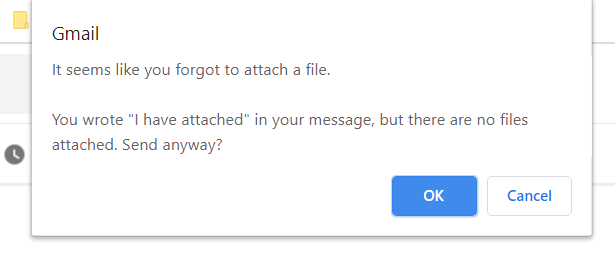
To bring this closer to home, think about when you try to send an email. Have you ever had that moment where you mentioned an attachment in the email but forgot to attach it? Many email services will remind you to attach a file. Or, let's say you're about to send a tweet that might not be very nice - Twitter might double-check with you before you tweet it. These are examples of friction helping out, making sure you don't do something you might regret later.

How Friction Affects User Experience: Pros and Cons
In my experience with several applications, I've found that friction in UX can be good and bad.
Pros
On the upside, it can make things safer. Things like two-step verification, CAPTCHAs, or fingerprint scans add an extra padlock to keep out fraudsters and data thieves.
Friction can also stop us from making mistakes. Think about when you're buying something online, and the site shows you a final summary of your order before you pay. That extra step lets you double-check your order and fix any mistakes. Another example is the popup that shows when you try closing a browser tab with multiple open windows.

When a site or app makes you do certain things, it's often to ensure they have the right info. Like when they ask you to confirm your email address to ensure you've typed it correctly. Friction can also guide us to do or not do certain things. For example, social media platforms might make it harder to post harmful content or send nasty messages.
Cons
Friction isn't always our friend. Too much of it can be a pain, causing people to give up on filling their shopping carts, signing up, or even make them leave the platform.
Extra steps can slow us down, which is a problem when we're in a hurry or just want to get things done quickly. More friction often means more complexity, making the platform harder to use, especially for folks who aren't that tech-savvy.
And if people find it too hard or slow to use a platform, they might use it less often or not at all.
So, it's all about balance. While friction can make things safer and stop errors, too much can create a frustrating user experience. It's up to the folks designing the user experience to consider the good and the bad when they decide how much friction to include.
Dojah’s Approach to Fraud Prevention and UX Friction
Dojah is Africa's first end-to-end onboarding and verification platform, helping businesses onboard verified Africans to their services. Dojah also offers services such as Compliance and Fraud Check.
As a designer at Dojah, my collaboration with our product and engineering teams is continuous and focused. Our collective goal is to prevent fraud for businesses and implement elements of UX friction when appropriate, all without over-complicating the process.
Here's how we strive to maintain this balance at Dojah:
- OTP Verification for Emails and Phone Numbers: One-time password (OTP) verification provides a seamless yet secure method of confirming a user's identity. By sending a temporary code to the user's registered email or phone number, we ensure that only the legitimate account holder can proceed with the transaction. This intentional friction is a simple yet effective means of authentication, combining the strength of multi-factor authentication with the simplicity that enhances user experience.

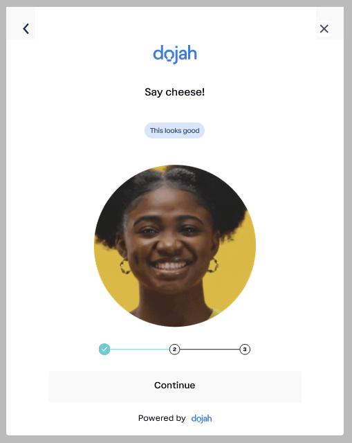
- Real-Time Capture of ID Documents During KYC: During the KYC process, we require users to provide essential identification documents such as their Driver's License, National Identification Number (NIN), etc. The real-time capture functionality allows immediate verification, streamlining the process without sacrificing security. This approach aligns with the demands for rapid yet reliable validation, balancing user satisfaction with robust fraud prevention measures.

- Liveness Check Using Selfie and Video Verification: A crucial aspect of fraud prevention is the liveness check, where a user is required to provide a selfie or undergo video verification. Especially for larger transactions, businesses utilizing our widget can ensure that the actual account holder is carrying out the transaction. While this additional step may momentarily slow down the user's flow, it serves a vital purpose in fraud prevention by authenticating that the user is not being impersonated.
Our goal at Dojah is not just about improving security. We also focus on the user and create a process where friction in UX design and fraud prevention work well together. By using new technology and careful design, we're leading the way in making the sign-up process secure and straightforward.
With these methods, we're setting new standards in UX design, focusing on both user satisfaction and safety. By carefully using some friction, we show how it can help fight fraud. This balanced approach is our vision for the future of fraud prevention, connecting innovation with user needs.
Conclusion
In the constantly changing world of technology, finding the right balance between user experience and security remains a challenging but vital task. My personal experience with fintech apps and my work at Dojah has taught me that sometimes, adding some difficulty can be a smart way to keep things safe.
We recognize that not all friction is harmful, and we see how it can strengthen our online transactions. We're working on a way to bring together convenience and protection.
The relationship between UX design and fraud prevention isn't a situation where one side wins and the other loses; it's a well-thought-out combination that improves both ease of use and security, leading to a more user-focused and secure digital world.
Start using Dojah for all your business needs